Freshly founded by a group of mathematicians, Odeen delivered deep technical precision: Building custom software, modernising microservices, and augmenting enterprise engineering teams across Europe.
Yet, despite their operational capability, they lacked a visual presence that matched their personality.
Their initial web presence was generic, hiding custom consultancy and scalable IT solutions behind corporate templates.
Mathematical precision, human energy
Enterprise clients do not hire software consultancies for abstract code; they hire them for certainty, transparency, and momentum.
B2B technology identities often lean into cold, bland aesthetics to signal trust. Odeen’s true advantage lies in pairing deep mathematical discipline with approachable collaboration.
We realised that enterprise credibility does not require visual silence. Trust is proven through precision and performance, not corporate blandness.
Shifting the industry frequency
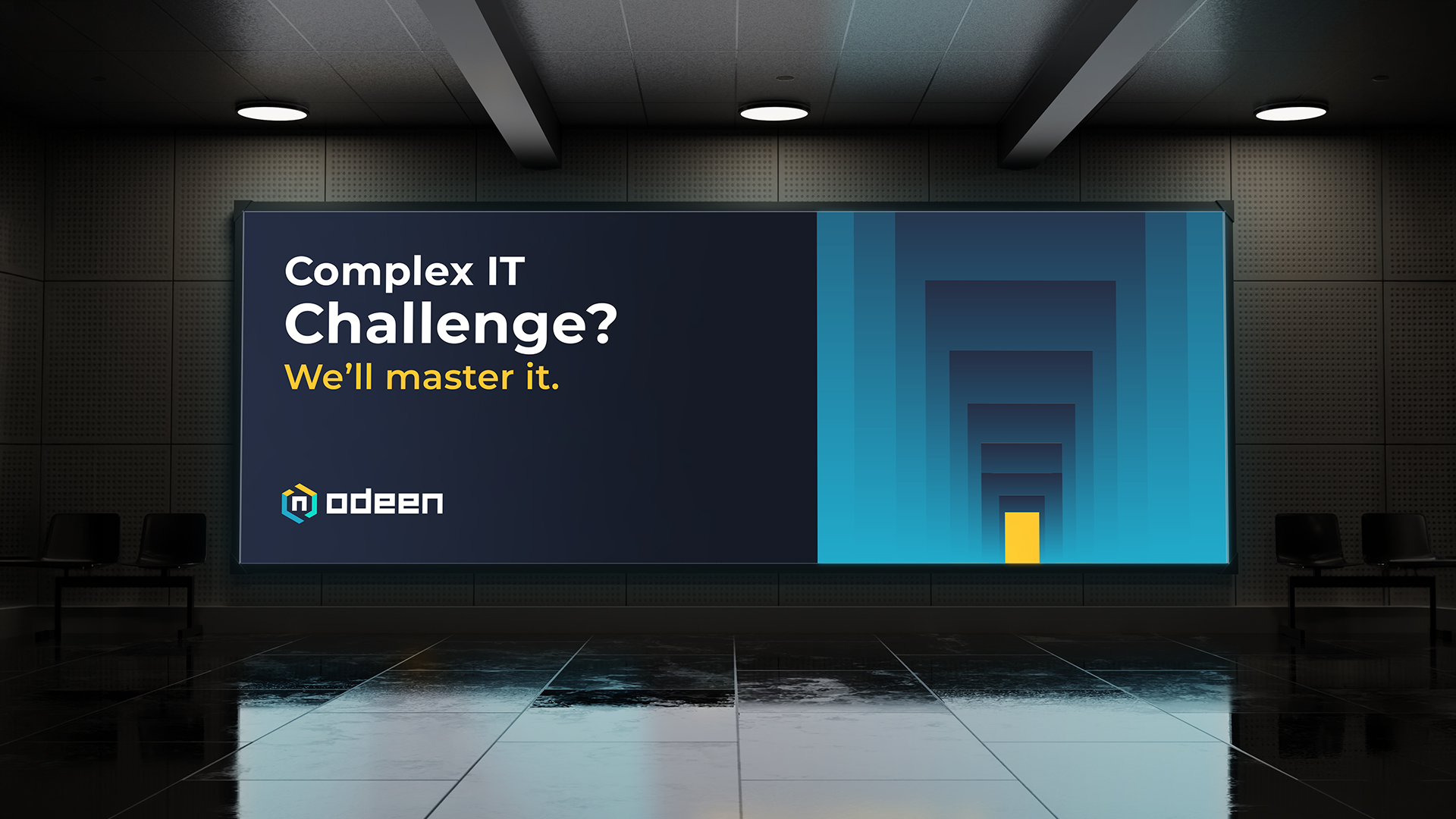
Standing out in B2B technology requires rejecting the sea of sameness.
Rather than fitting into the quiet background of traditional IT vendors, Odeen took on an identity defined by structure & clarity. By establishing a distinct identity early, Odeen gained a voice that stands out immediately in a crowded market.
The complete formula
To bridge the gap between complex software architecture and non-technical business leaders, we built a visual and digital system grounded in clarity.
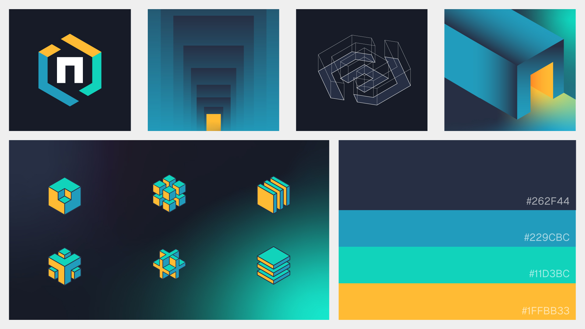
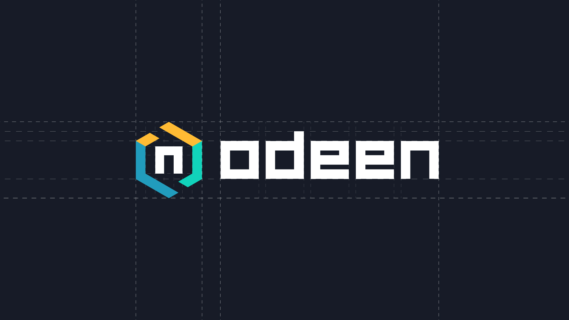
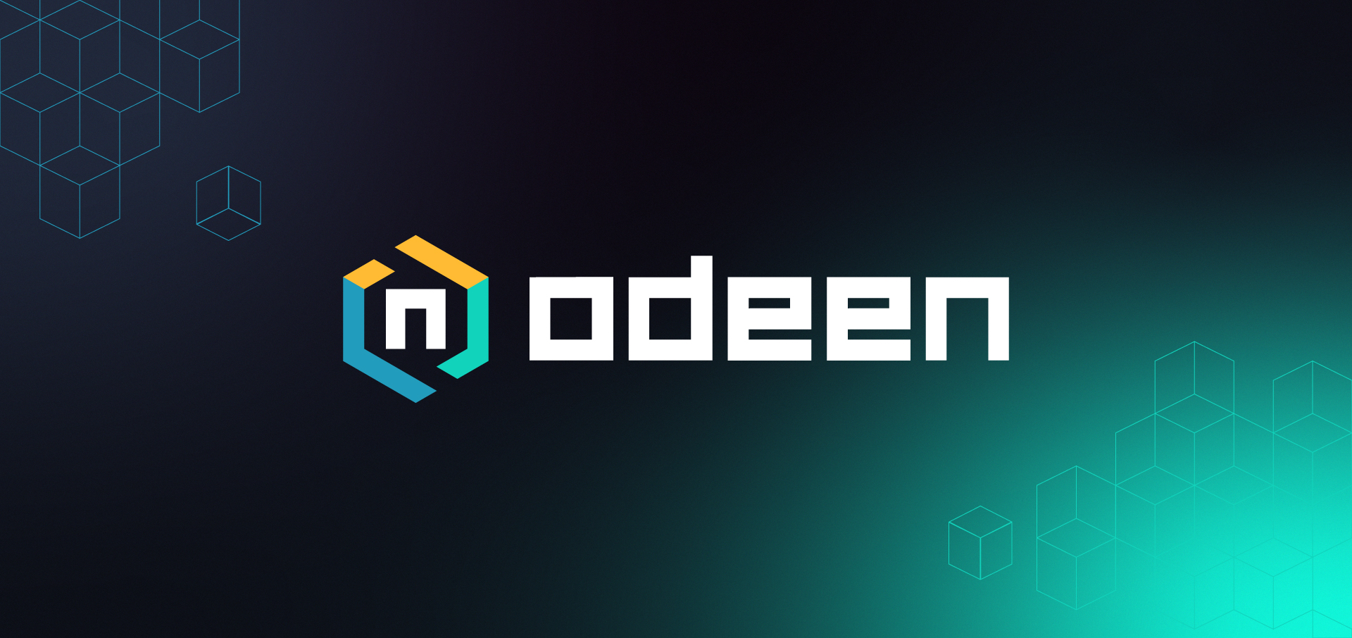
The logomark was constructed with mathematics in mind, paying homage to the founders’ roots while establishing a recognisable visual anchor.
Precision in practice
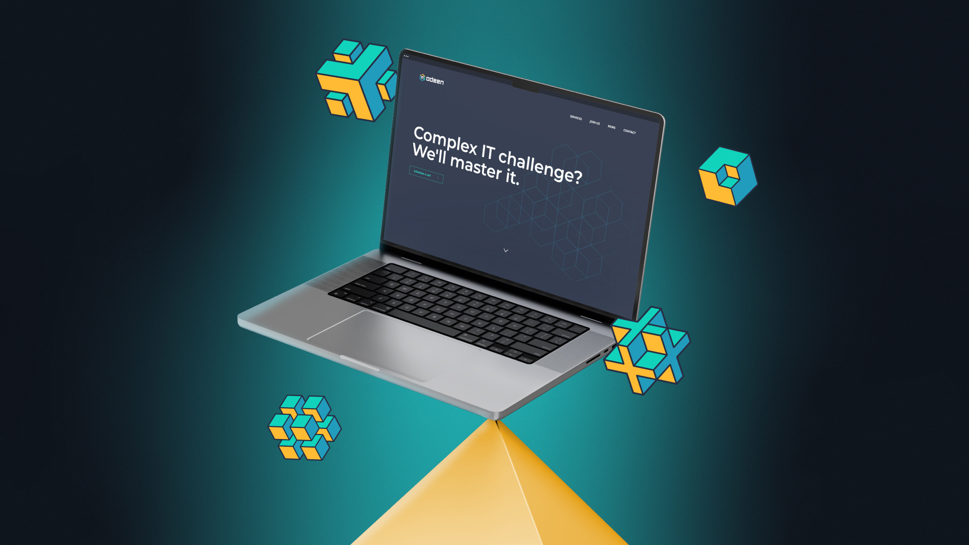
We structured the presentation website around clean information architecture, making dense technical capabilities readable and intuitive for executive decision-makers.
Inspired by the impossible.
We engineered a logomark rooted in mathematical geometry and impossible structures, turning technical exactness into an intriguing visual anchor.
The outcome
By rejecting the dull conventions of enterprise software branding, Odeen established a clear market presence at launch.
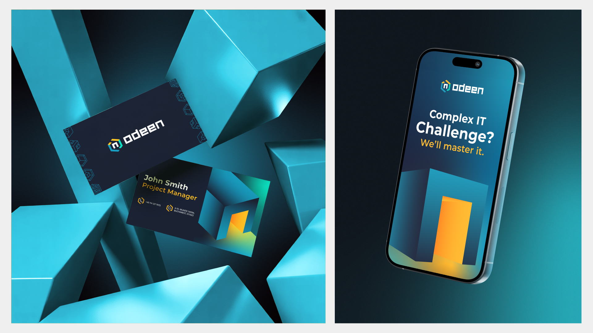
The brand identity provided the new business with the confidence, clarity, and visual authority required to engage ambitious enterprises, proving that rigorous engineering and vibrant identity belong together.
What the client had to say
“With AQV we recently redefined our company brand and also redesigned the website. I am super happy not only with the final result but also with how good I felt throughout the collaboration. Relaxed discussions, full of humor and good cheer, which inspire positivity and creativity. Super thanks!”